Plotting Multiple Distributions or Kernel Densities with Gnuplot
May 2, 2025
Often we have to visualize not one but multiple probability distributions and/or kernel densities. There are many options to visualize the data, for example, using a multiplot, overlapping the distributions or using violin plots. We will use the following distribution of heights of men and women, obtained from the U.S. Census Bureau, in the examples below.
height  men   women
58      0     1.7
59      0     1.4
60      0     2.9
61      0     5.6
62      0     8.1
63      3.1   11.6
64      1.3   15.3
65      2.3   14.6
66      6.4   12.8
67      6.5   10.9
68      12.6  6.9
69      13.2  4.3
70      12.7  2.8
71      11.3  0
72      9.1   0.5
73      10.5  0.5
74      5     0.1
75      1.8   0
76      1.8   0
77      1.8   0
78      0.1   0
height.txt
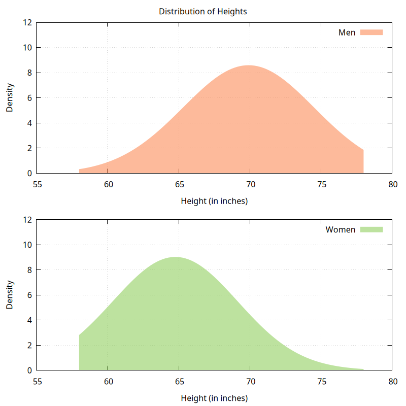
Multi-plot
We can use the Gnuplot multiplot feature to place multiple plots within the same figure. An example figure and the gnuplot script are shown below. The colors were chosen using ColorBrewer.
set style fill transparent solid 0.6 noborder
set grid
set yrange[:12]
set xlabel "Height (in inches)"
set ylabel "Density"
set term pngcairo size 800,800
set output "multiplot.png"
set multiplot layout 2,1 title "Distribution of Heights"
plot "height.txt" u 1:2 smooth kdensity with filledcurves y=0 lc rgb "#fc8d59" t "Men"
plot "height.txt" u 1:3 smooth kdensity with filledcurves y=0 lc rgb "#91cf60" t "Women"
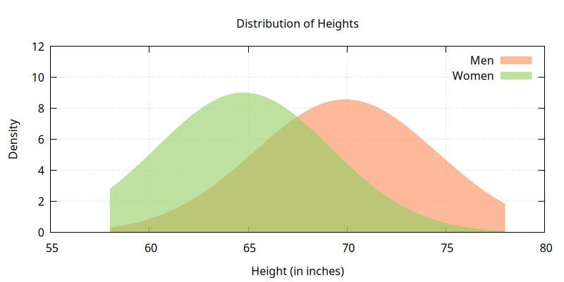
unset multiplotOverlapping distributions
We can place multiple distributions on the same plot by exploiting the transparency style of filled curves. An example figure and the gnuplot script are shown below.
set style fill transparent solid 0.6 noborder
set grid
set yrange[:12]

set xlabel "Height (in inches)"
set ylabel "Density"
set title "Distribution of Heights"

set term pngcairo size 800,400
set output "overlapping_filled.png"

plot "height.txt" u 1:2 smooth kdensity with filledcurves y=0 lc rgb "#fc8d59" t "Men", \
     "height.txt" u 1:3 smooth kdensity with filledcurves y=0 lc rgb "#91cf60" t "Women"
Violin plot
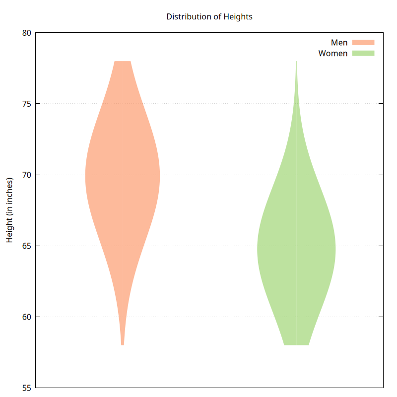
Violin plots are another popular way to compare distributions. They are essentially two sided kernel density plots. They can be horizontal or vertical. An example figure of a vertical violin plot and the gnuplot script are shown below. Violin plots are not natively supported in Gnuplot. The trick shown in gnuplot demo is to
- Save each kernel density plot to a data block (table).
- Plot vertically using y:x instead of x:y.
- Mirror the plot vertically (optional).
- Add appropriate offsets along the X-axis to separate the distributions.
set style fill transparent solid 0.6 noborder
set grid

set title "Distribution of Heights"
set ylabel "Height (in inches)"

set table $men
plot "height.txt" u 1:2 smooth kdensity with filledcurves y=0
unset table

set table $women
plot "height.txt" u 1:3 smooth kdensity with filledcurves y=0
unset table

set xrange [0:4]
set yrange [55:80]
set format x ""
unset xtics

set term pngcairo size 800,800
set output "violin.png"

plot \
    $men using (1+($2/20)):1 with filledcurves x=1 lc rgb "#fc8d59" t "Men", \
    $men using (1-($2/20)):1 with filledcurves x=1 lc rgb "#fc8d59" t "", \
    $women using (3+($2/20)):1 with filledcurves x=3 lc rgb "#91cf60" t "Women", \
    $women using (3-($2/20)):1 with filledcurves x=3 lc rgb "#91cf60" t ""